

One system. Four platforms. Built together.
It started by bringing people together
Rise is the design system at NewDay, a UK consumer credit provider whose purpose is to help people move forward with credit. NewDay runs its own credit brands, such as Aqua and Bip, alongside partner brands including John Lewis, Argos and AO, so Rise has to work for many brands at once.
Before Rise, web, iOS and Android each had their own libraries, logic and look. Designers didn’t know what had been built, engineers couldn’t trust what was in Figma, and brand consistency was down to luck.
So before designing anything, we brought the right people into the room: designers, engineers, product leads, accessibility champions and brand partners. A Design System Council, weekly mobile check-ins and regular cross-platform syncs gave everyone a say in what Rise became, and a shared language to build it with.
Senior Product Designer at NewDay · Figma, Tokens Studio, GitHub, Jira and Claude
Brand
Creating the Rise brand
I led Rise’s visual identity: a modern, accessible palette, type that balances personality with readability, and iconography built on the same tokens as the components. Defining it early gave the system one recognisable voice on every platform.
Foundations
Tokens: the language everything speaks
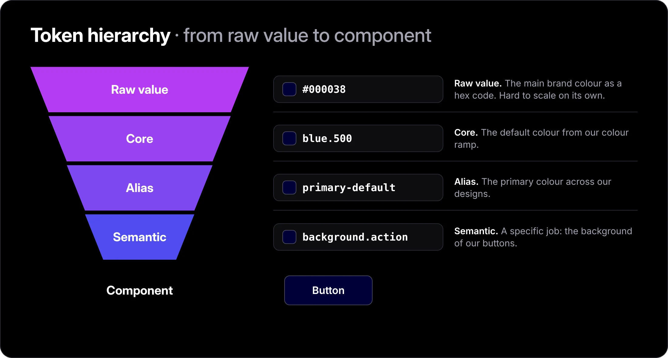
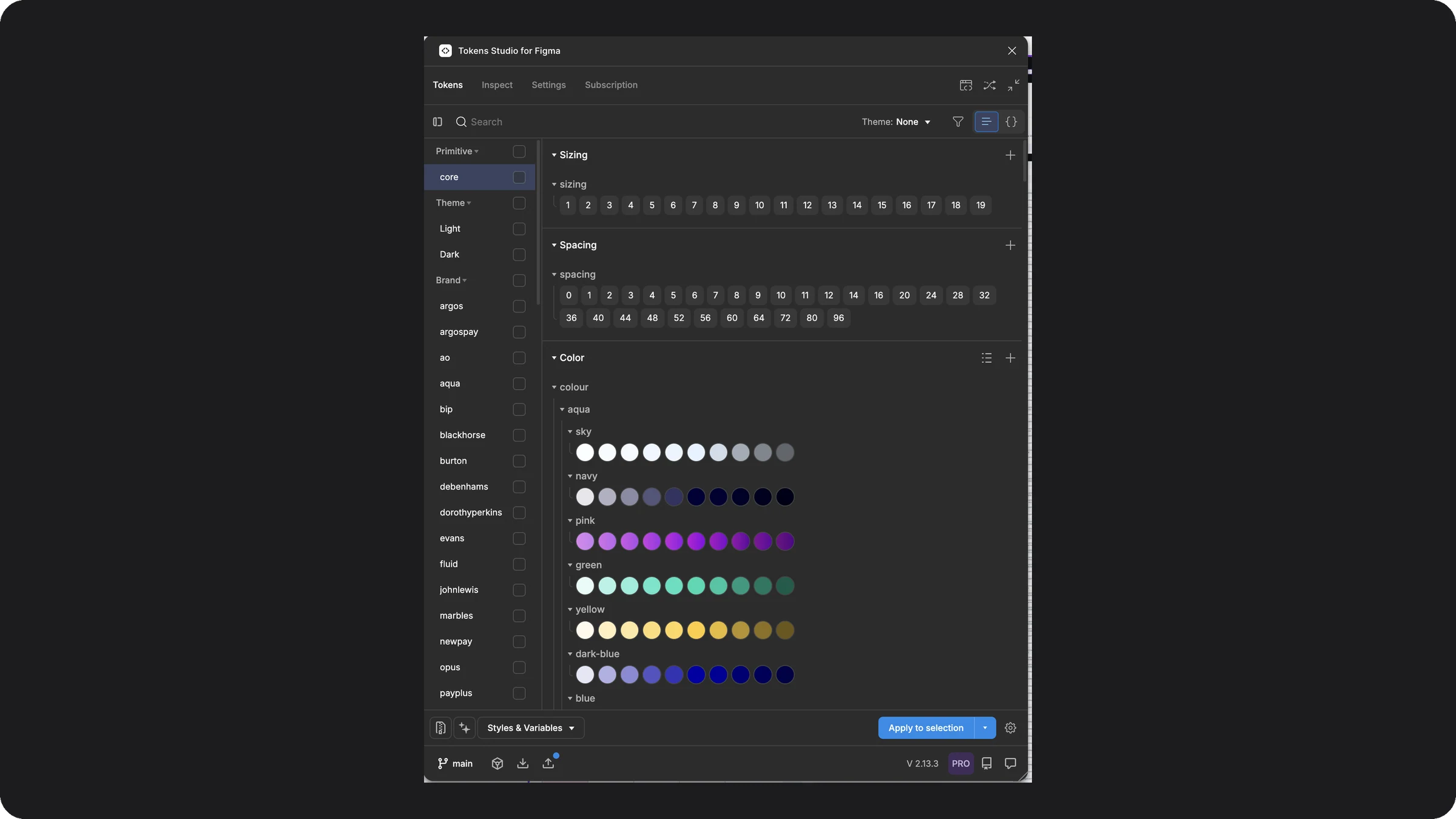
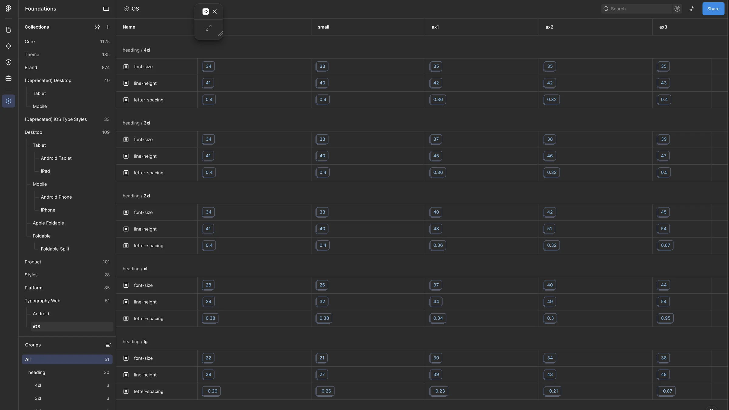
Tokens describe colour, type, spacing, elevation and more in a way every platform can use. I manage them in Tokens Studio and export them to Figma variables, so designers work with native options and engineers get clean, consistent values. Type tokens also cover every accessibility text size on iOS.
Theming
One set of components, many brands
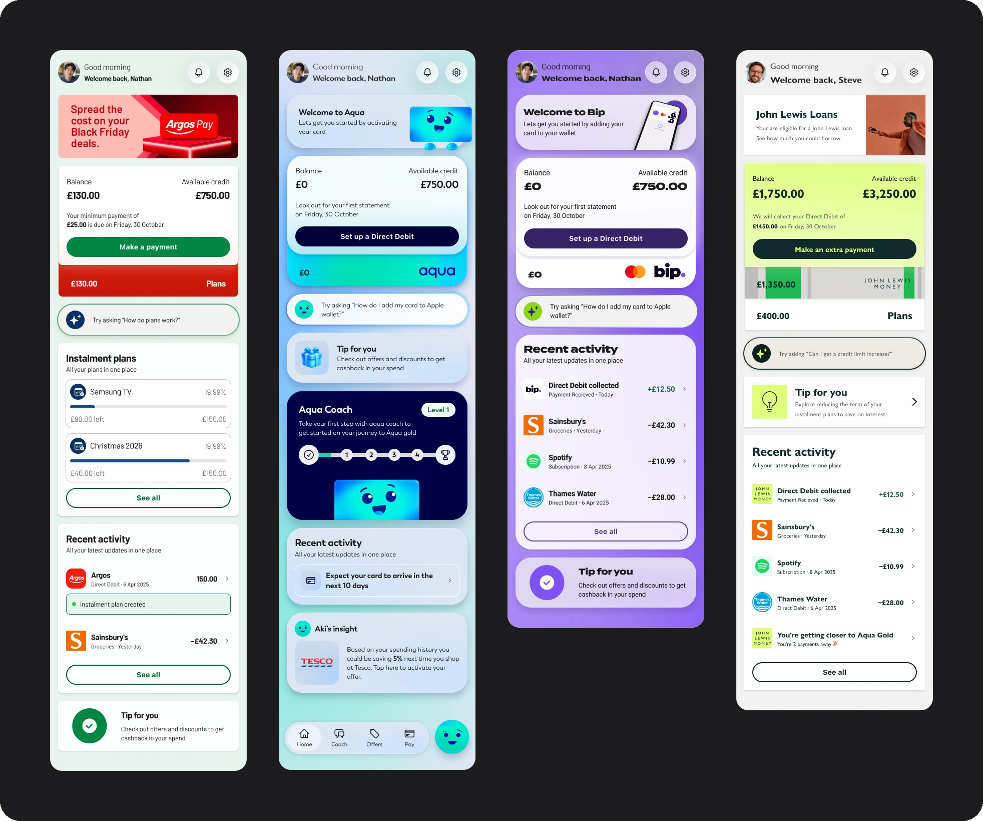
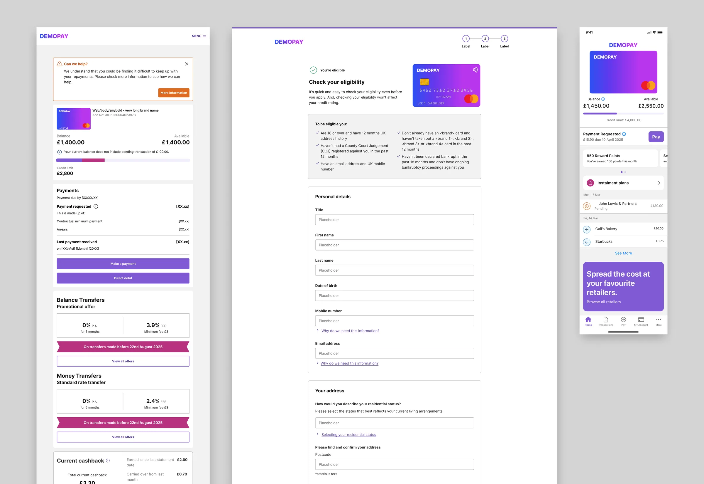
Every brand has its own token set, so one library of components carries more than 20 identities. Below is the account summary for Argos Pay, Aqua, Bip and John Lewis Money, built from the same Rise components.
Delivery
One pipeline from design to code
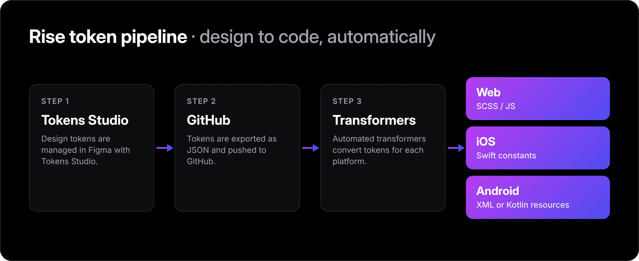
Tokens are exported from Tokens Studio as JSON and pushed to GitHub, where automated transformers turn them into SCSS and JS for web, Swift for iOS, and XML or Kotlin for Android. Each team gets exactly what it needs, in the format it needs, with no handoff.
Cross-Platform
Built for web, iOS, Android and SaaS
Rise was built for web, iOS and Android from the start, and it also powers our SaaS platform. Components behave natively on each platform but share the same foundations, so a toggle looks right on iOS, behaves correctly on Android and still feels consistent with web.
The system is split into Figma libraries for foundations, web components, iOS components and web patterns.
AI-Assisted Workflow
Components and docs built with AI, approved by people
Rise’s tokens and existing components are connected to Claude through MCP servers, and our in-house mobile app holds the whole component library. Everything Claude creates is grounded in the real system: the same tokens, patterns and building blocks as everything already in Rise.
1. Generate. I prompt Claude to create new iOS components from scratch, working from our tokens and already-built components through the MCP.
2. Document. Claude also writes each component’s documentation: variants, when to use it, usage examples, accessibility and known gaps. Docs that used to be written by hand now arrive with the component, which has vastly sped up our workflow.
3. Publish to Figma. Components are placed back into our Figma libraries, ready for our 15 product designers to use in their projects.
4. Review and adopt. Nothing is formally adopted into Rise until every team has discussed and signed it off in our adoption pipeline.
5. Extend. Approved components are run through again to create their Android counterparts, using established Android patterns rather than copying iOS.
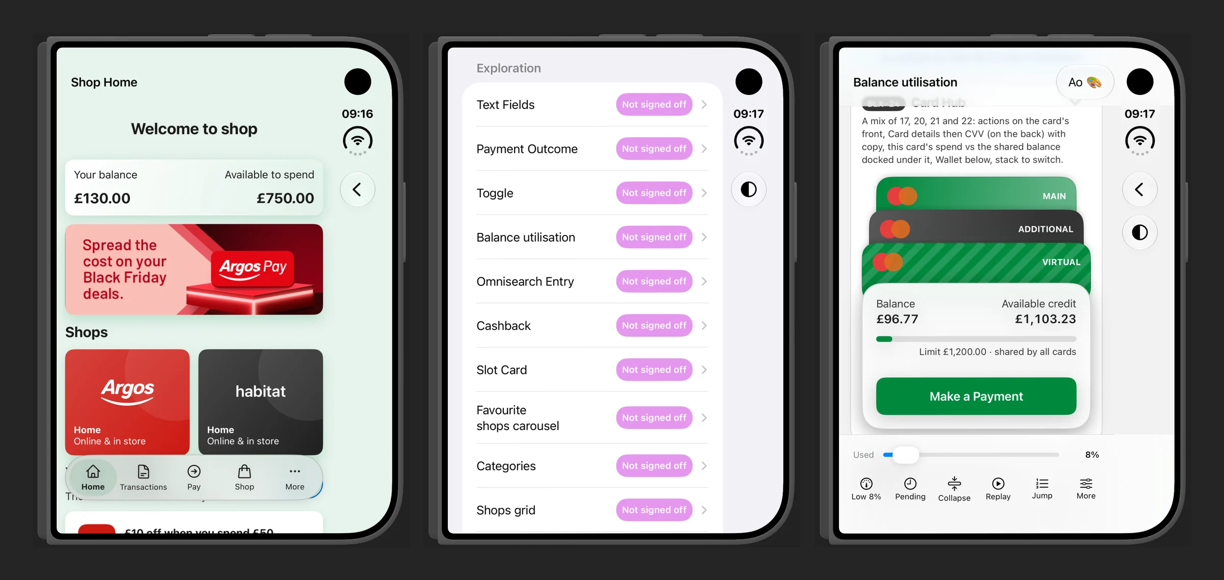
Our in-house app on the iPhone Duo. Every component runs on a real device, with its sign-off status alongside it.
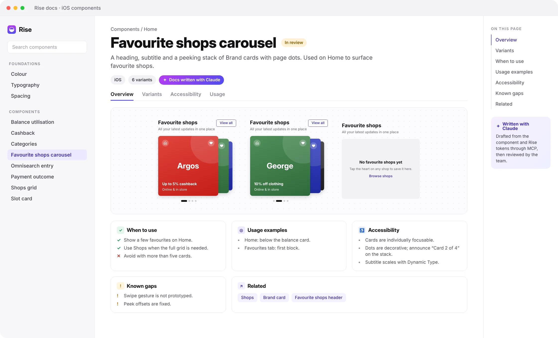
Documentation for the Favourite shops carousel, written with Claude.
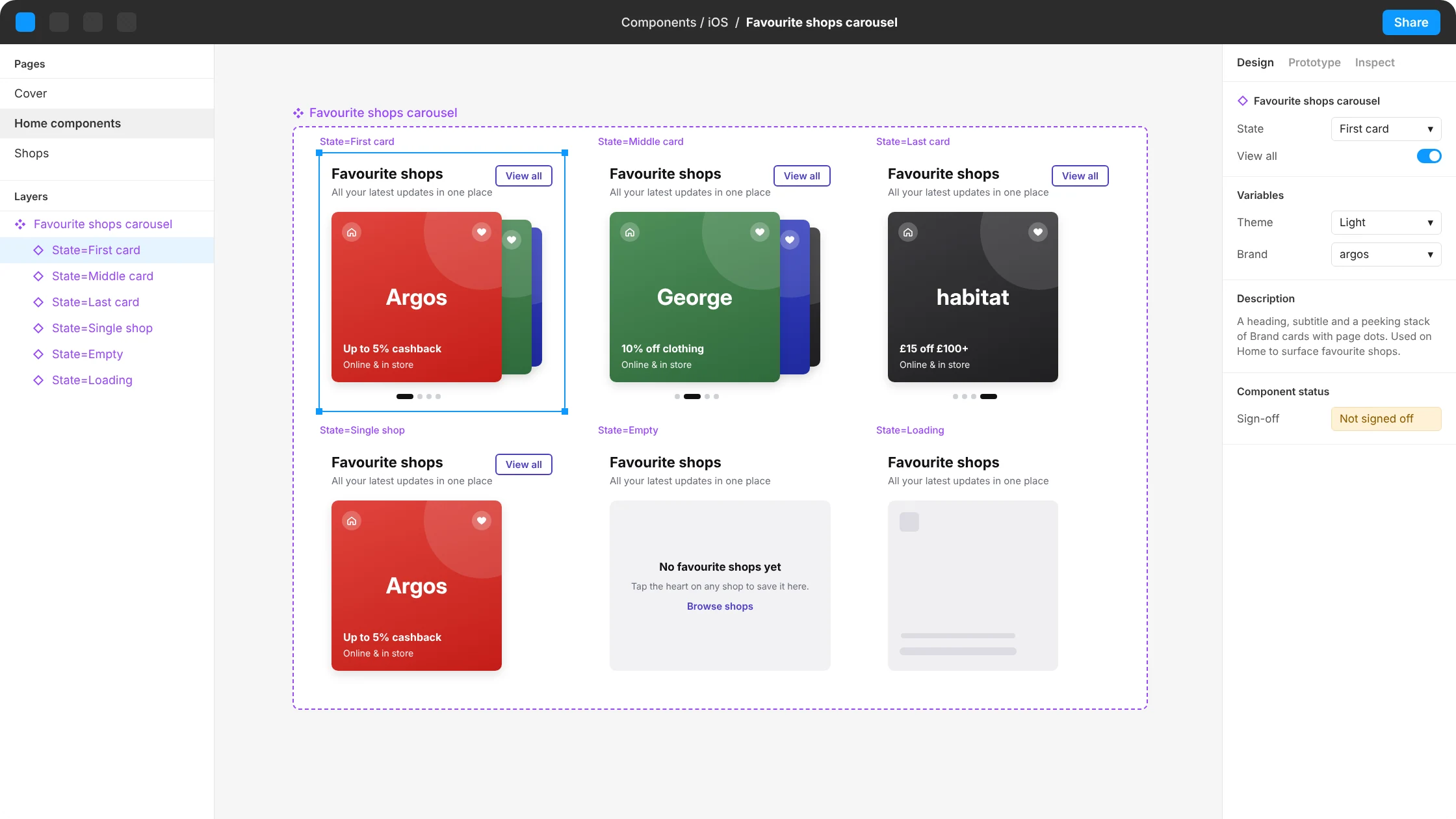
The same component in Figma: one component set, six variants.
User Testing
Testing components inside real journeys
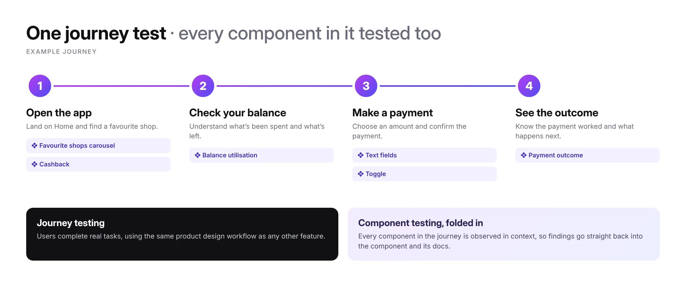
We test Rise components the same way our product teams test any design: with users, as part of real journeys. Instead of running separate component studies, we fold component testing into journey testing.
When a journey is tested, every component in it is tested too, in the context people actually use it. What we learn about a component goes back into its design and documentation.
Release Management
One plan in Jira, so no two teams build the same thing
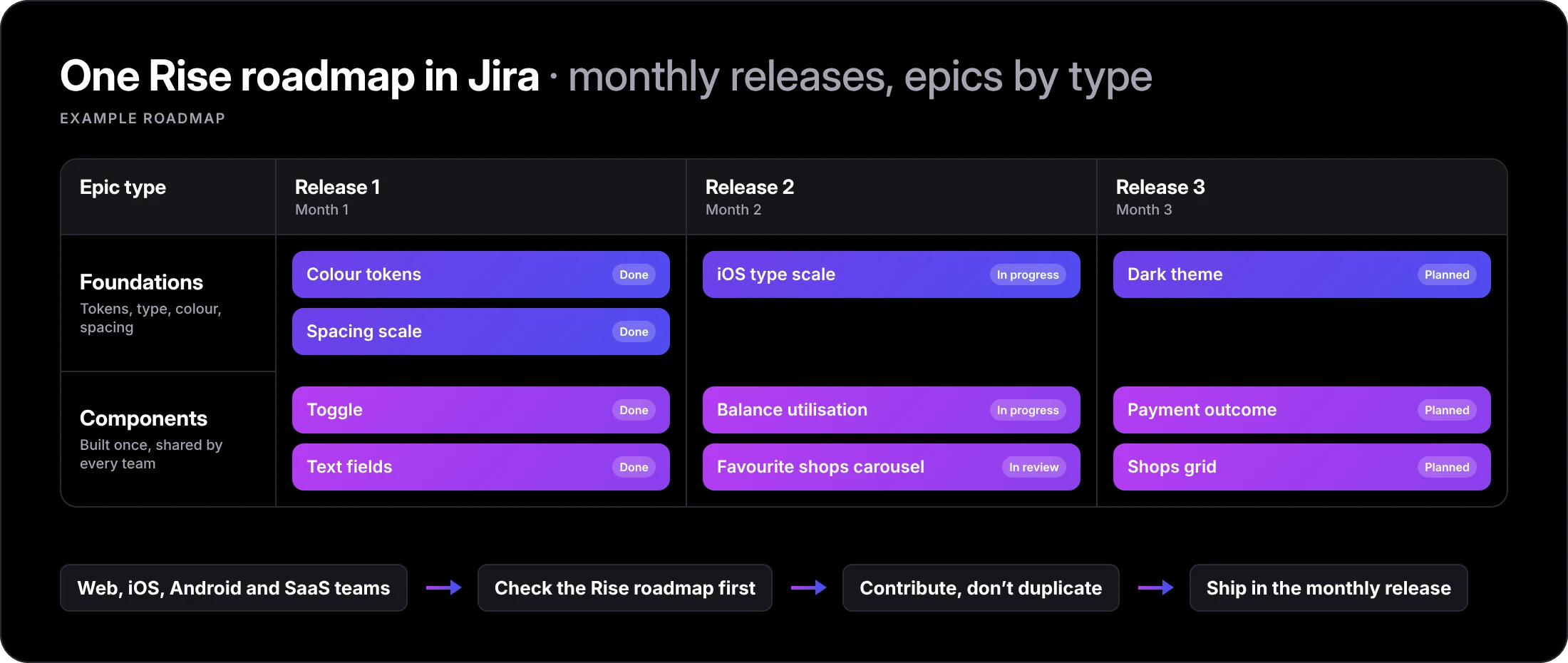
With several teams building on Rise at once, the biggest risk was two teams solving the same problem in parallel. All Rise work is planned and tracked in Jira, so every team can see what is coming before they start something new.
1. Monthly releases. Rise ships on a monthly release cycle, so teams know when new work will land and can plan around it.
2. Epics by type. Work is organised into different epic types, such as foundations and components, so it is always clear what kind of work something is and where it belongs.
3. One shared view. Because everything lives in one place, teams can check what is already planned or in progress, which stops work being duplicated.
The Results
From chaos to clarity
Rise gave every team a shared vocabulary and the confidence that what they were building was right. Alongside the figures at the top of this page: